The wordmark stayed.
Everything else
calmed down.The wordmark
stayed.
Everything else
calmed down.
- Client
- ADLAS Digital Solution GmbH, Vienna
- Period
- 2024 and 2026, two stages
- Disciplines
- Brand, Digital
- Our part
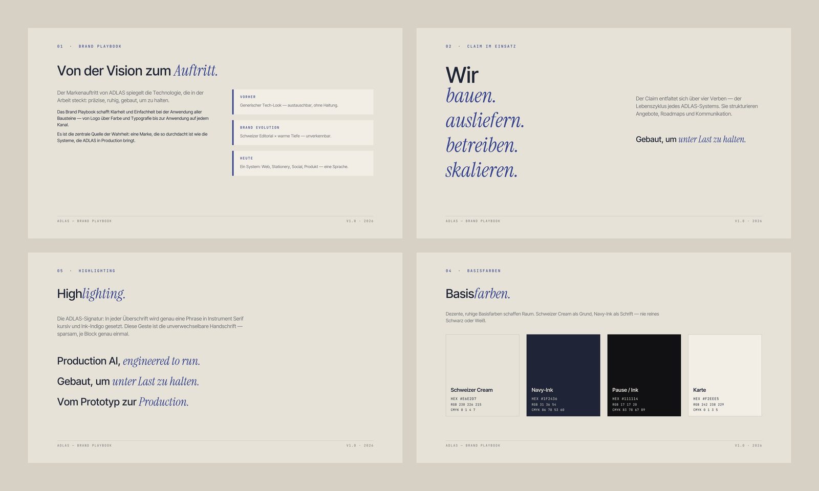
- The entire brand in two stages, with wordmark, monogram, colour, typography, brand playbook and templates for social and web.
Brief
ADLAS builds software and AI systems for businesses. We designed its first identity in 2024. By 2026 the company needed a system that works the same way on the website, in presentations and in documents.
2024
A tactile mark: the “A” as an upward arrow, sculpted in coral. Alongside it, the thin-line wordmark.
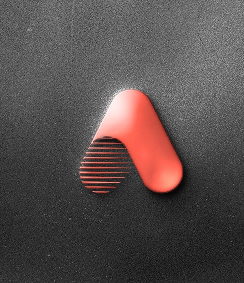
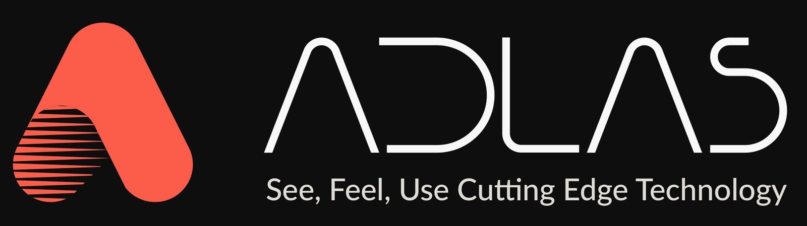
Mark as 3D rendering and logo with 2024 tagline
Idea
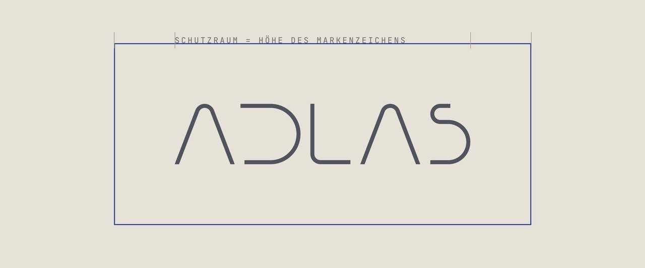
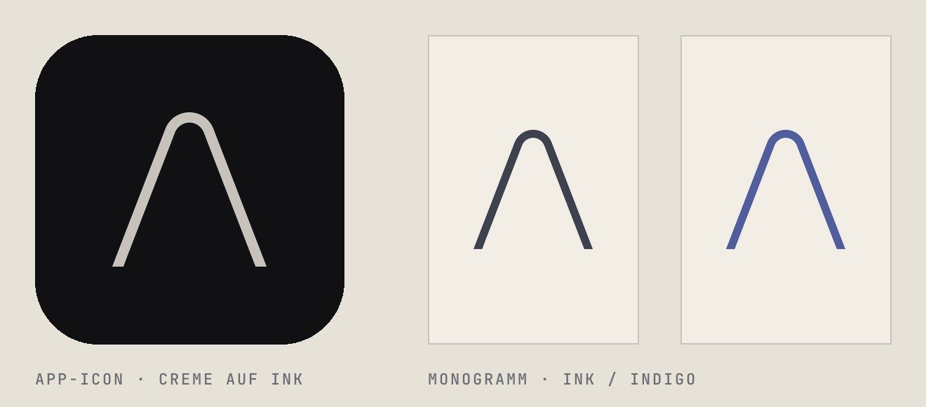
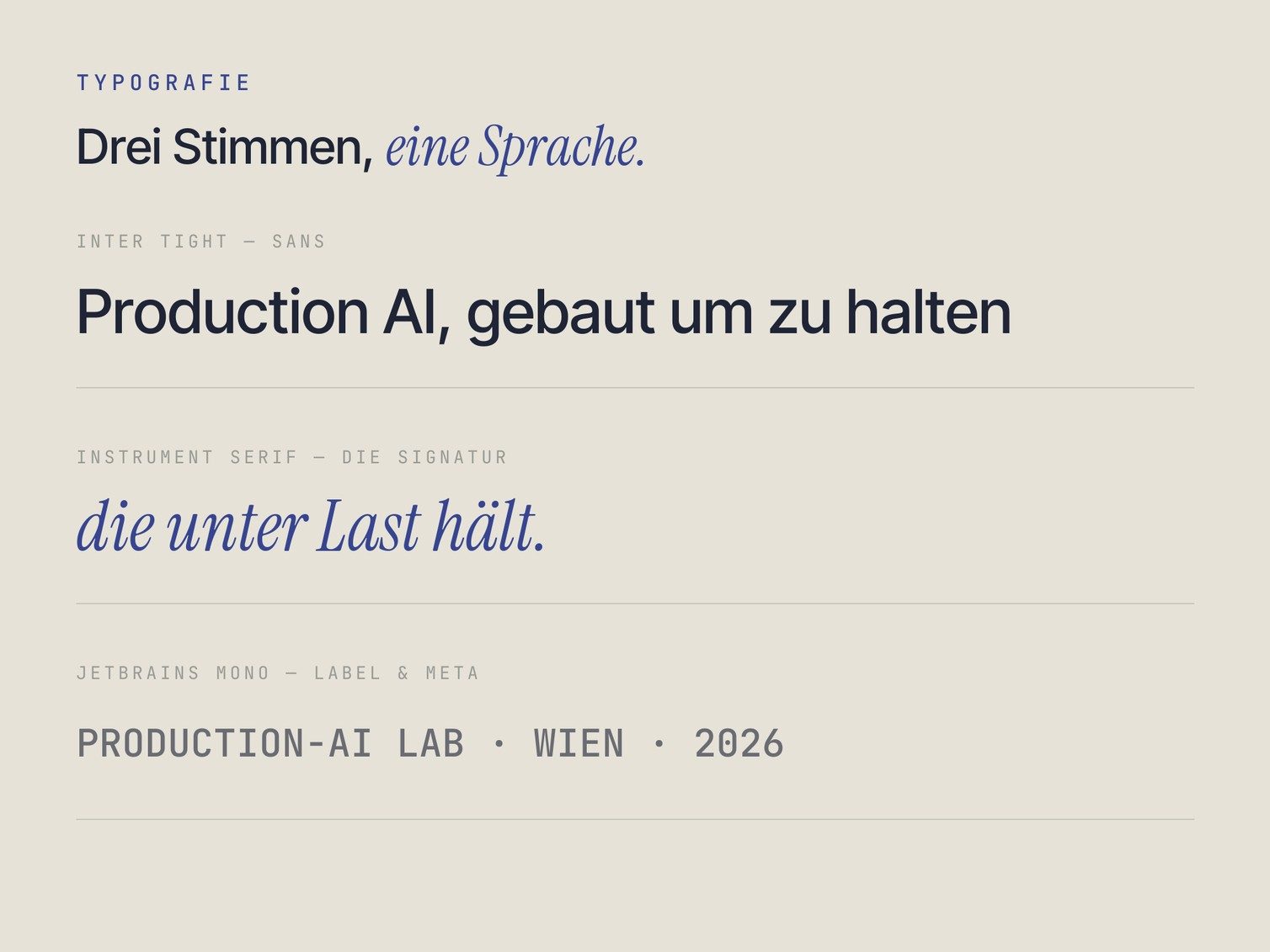
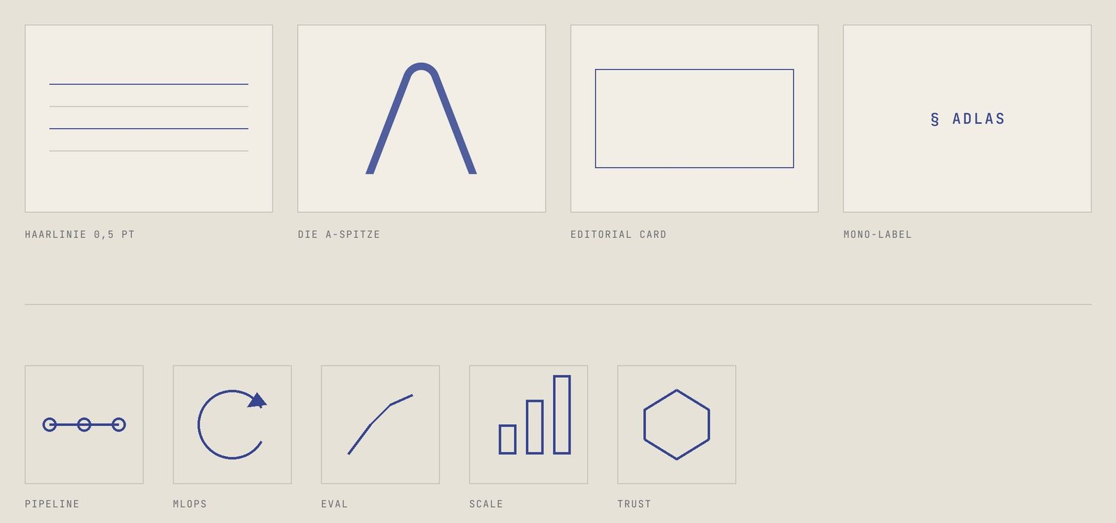
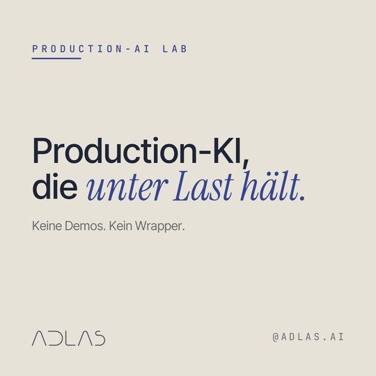
We kept the thin wordmark and took everything else from the tip of its “A”: the monogram, the app icon and the measure for every shape. Then a rule that makes the brand recognisable: in every headline, exactly one phrase is set in italics.
Colour system
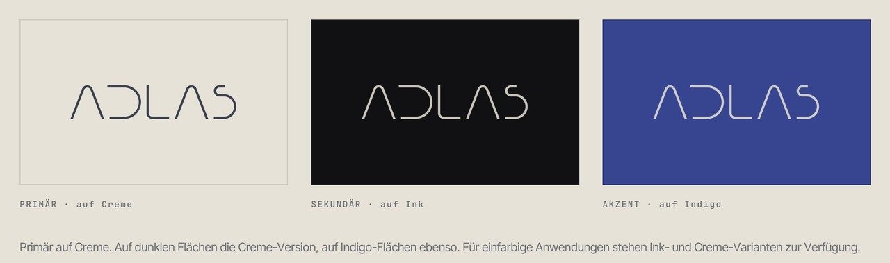
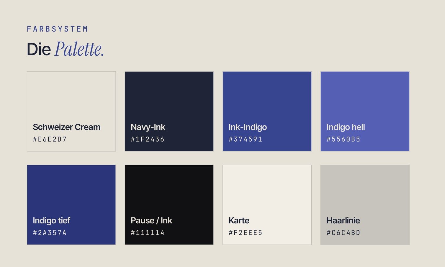
- Schweizer Cream#E6E2D7
- Navy-Ink#1F2436
- Ink-Indigo#374591
- Indigo hell#5560B5
- Indigo tief#2A357A
- Pause / Ink#111114
- Karte#F2EEE5
- Haarlinie#C6C4BD
Applications
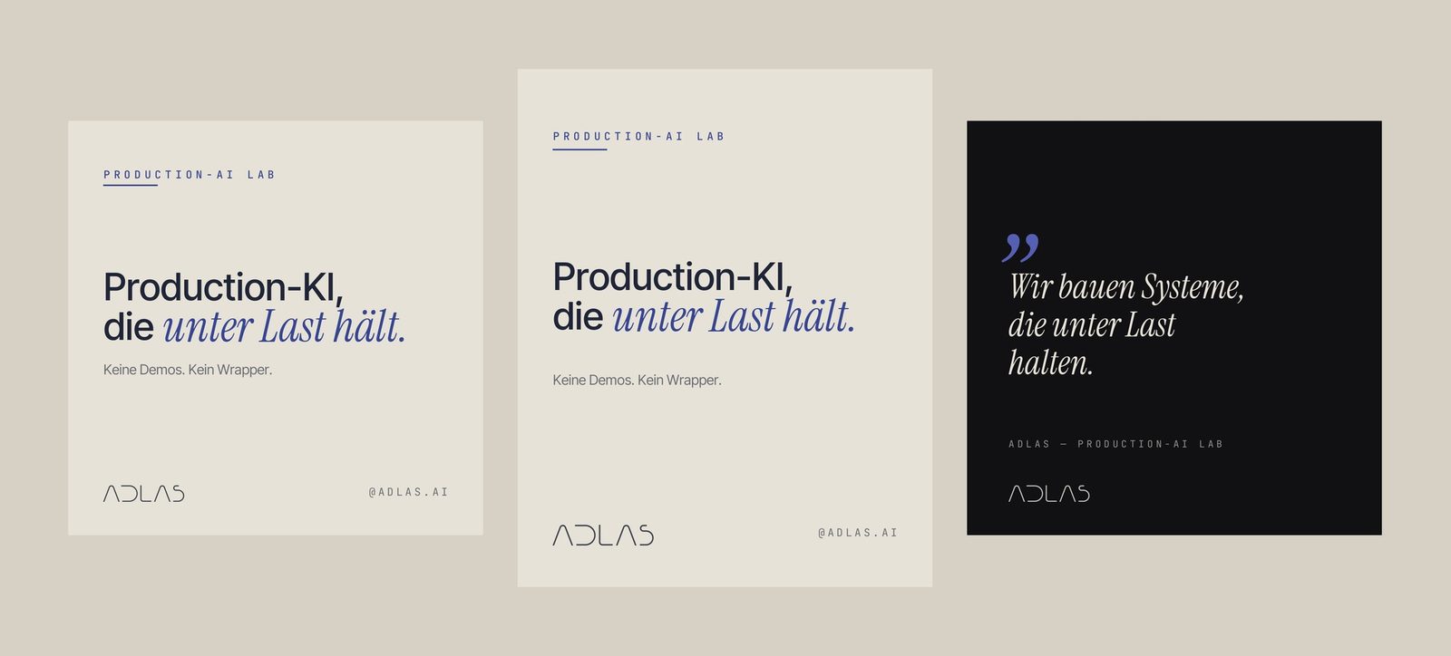
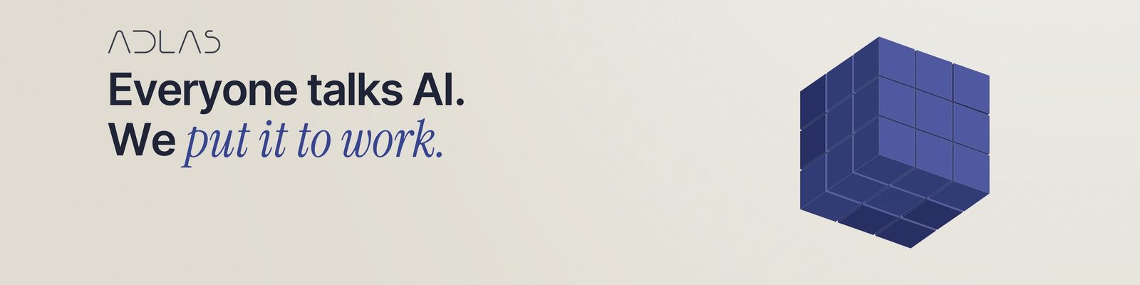
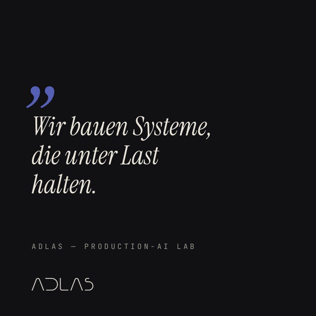
Deliverables
Wordmark and monogram as vectors, colour and type system, brand playbook (42 pages), social kit for Instagram and LinkedIn, favicons and app icons, website design system.