- Client
- WERKING Tools, Vienna
- Period
- 2026
- Disciplines
- Brand, Digital
- Our part
- Rebrand with product family, colour system and typography, website design and development, product views for desktop and mobile
Brief
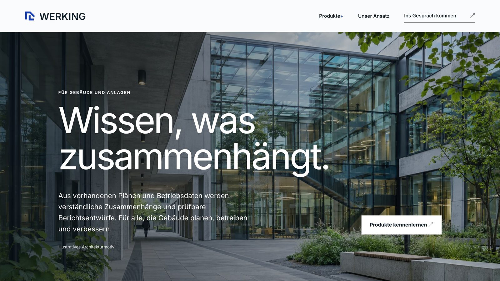
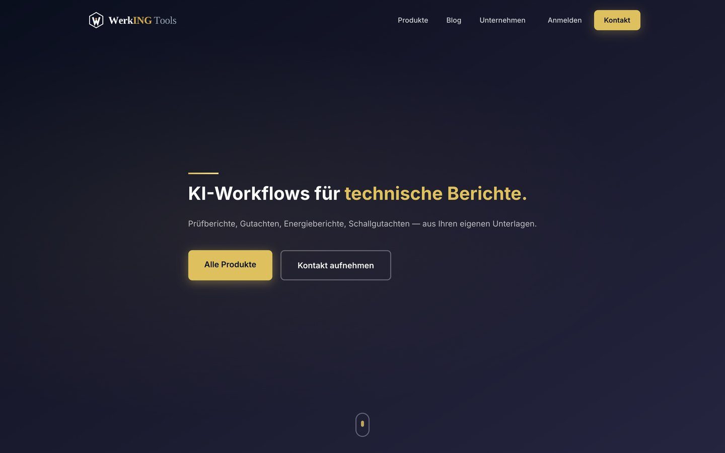
WERKING, based in Vienna, builds software for buildings and plant: energy reports from operating data, reports that follow an office’s own standards, and noise calculations. The previous look was dark and gold and spoke mainly to engineering firms. The brief: a brand that can carry several products, and a website that makes technical software clear to anyone who plans, runs or improves buildings.
Idea
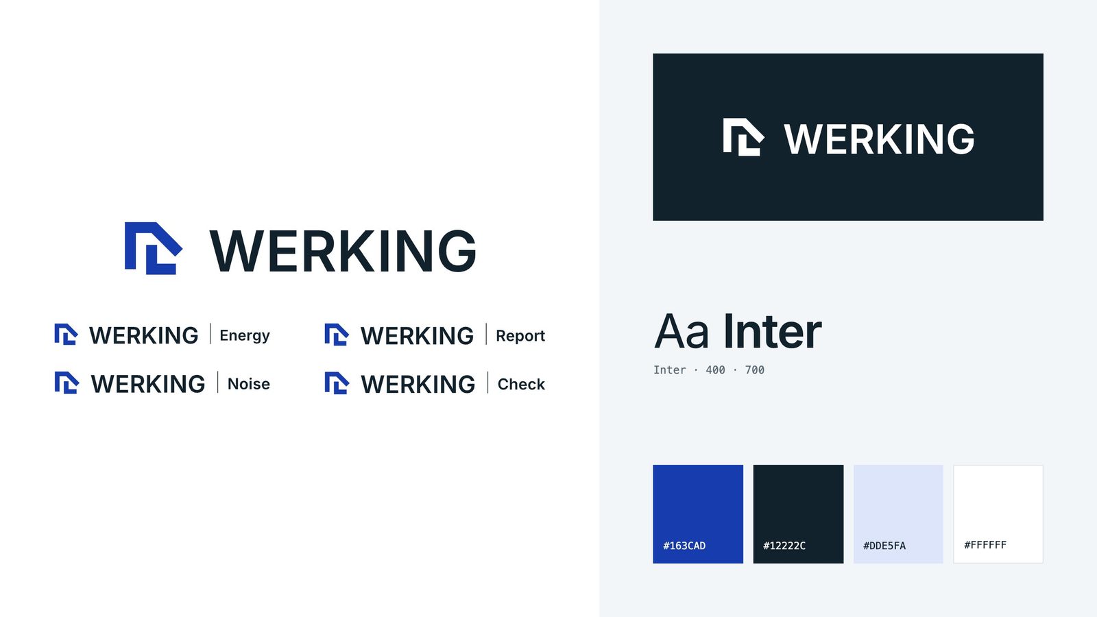
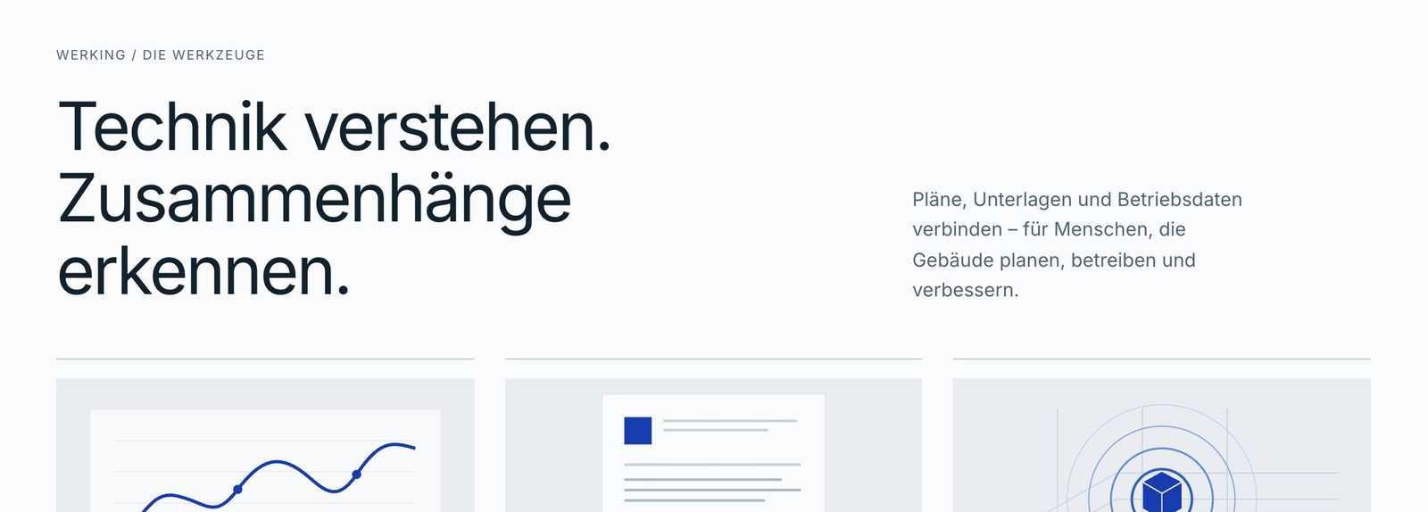
One mark, one family. The same symbol leads every product: Energy, Report, Noise and Check. Cobalt on a light ground replaces gold on black, and the website shows the product at work before it explains it.
Brand
Symbol and wordmark work on light and dark. Each product gets the same lockup with its own name, so the family can grow without new marks.
Website
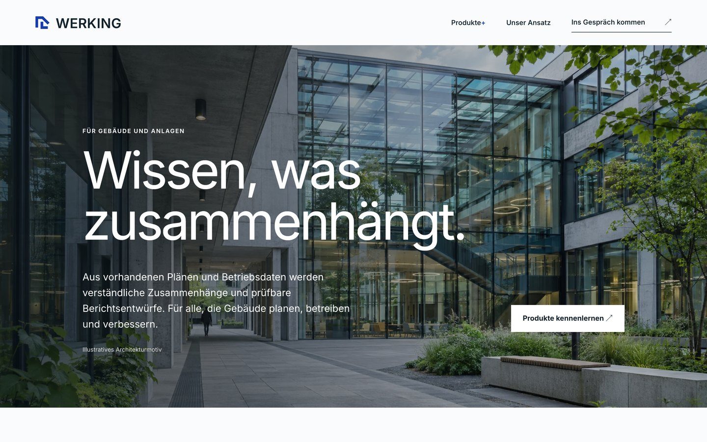
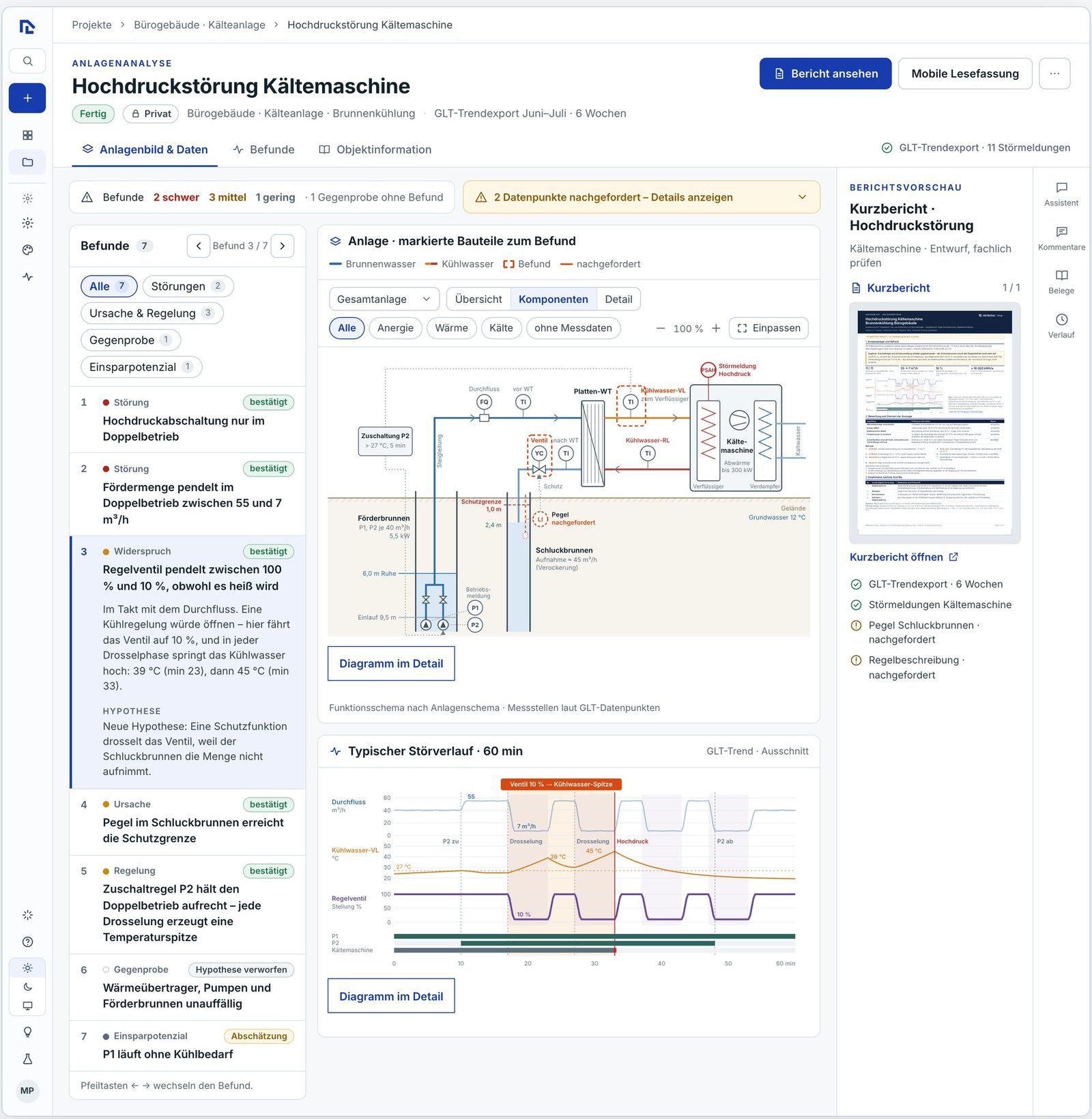
One running example carries the home page, product page and report: a chiller that keeps shutting down. Visitors see findings, highlighted components in the plant schematic, the fault pattern and the finished short report, all with prepared sample data.
Deliverables
Rebrand with symbol and wordmark for light and dark, product lockups for Energy, Report, Noise and Check, colour system and typography. Website design and development with product pages, sample views and a schematic generator, for desktop and mobile, including the technical handover to the WERKING team.
The product views show demonstrations with prepared sample data.